Dining (Over)hall
How do you design a responsive website serving over 400 locations?
Challenge
Aramark was looking to improve the overall customer experience and expand the usage of their platform. Every campus using their system had many locations and options for customers to choose from. In its current state, it was difficult to both find a specific location and explore multiple options. The new solution needed to work with their existing backend management systems that controlled real-time delivery of perishable items, online and in-person purchasing, and integration of other tracking systems.
My Role
I led the UX and design direction for this project, partnering directly with business owners and a third-party vendor to balance competing priorities under significant time constraints. My role spanned strategic framing, customer journey analysis, information architecture, UI design, and copy direction.
Process
Because my team was working not just with our client but also other vendors, time became the driving force in managing the project. I worked directly with the business owners to understand their needs and ensure the new product would support their business goals. At the same time, I collected and analyzed current customers' journeys, using them to identify where we could improve the user flow and offer better services.
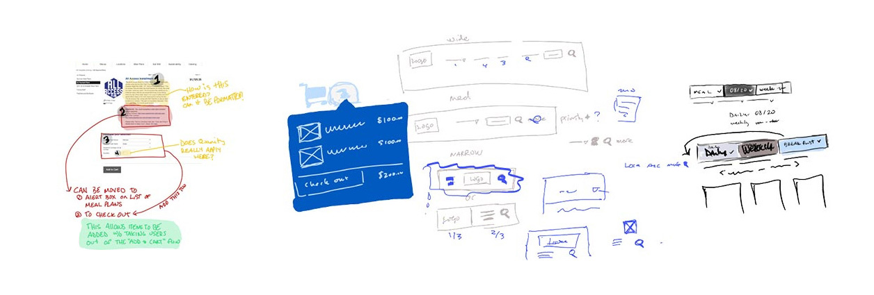
Brainstorming UI solutions
My first priority was to design a flexible system to serve the campus businesses while also helping their customers find what they were looking for. After that, I focused on the purchase flows to ensure customers could complete their purchases with the least friction possible.
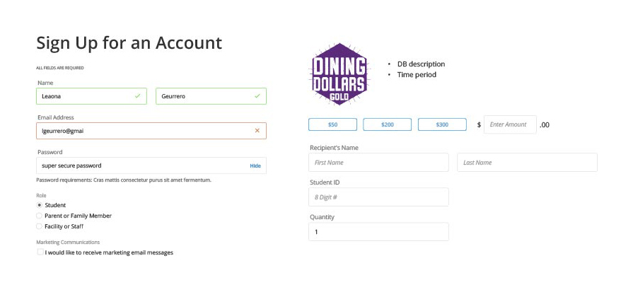
Refining and standardizing forms
Tactical changes
I focused on refining and simplifying the design, creating less complex forms, card-based information grouping, and a lightweight, approachable visual personality. I worked with the client's product owner to review and revise the copy, rewriting it for clarity and giving it a more human voice. I also consulted with them on how to approach evaluating future copy.
Organizing data
Results
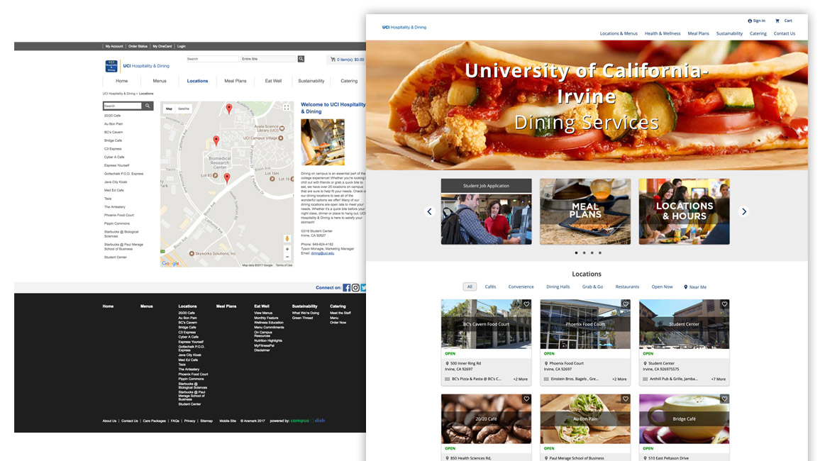
Previous design (left), new design (right)
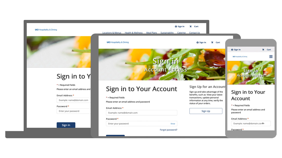
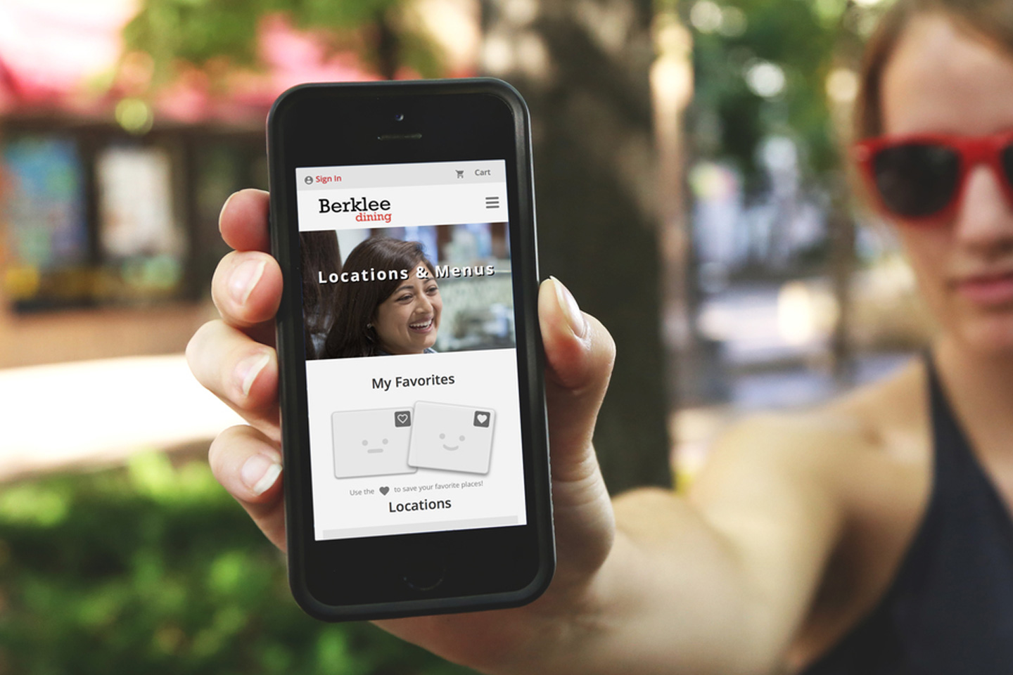
Forms are fully responsive
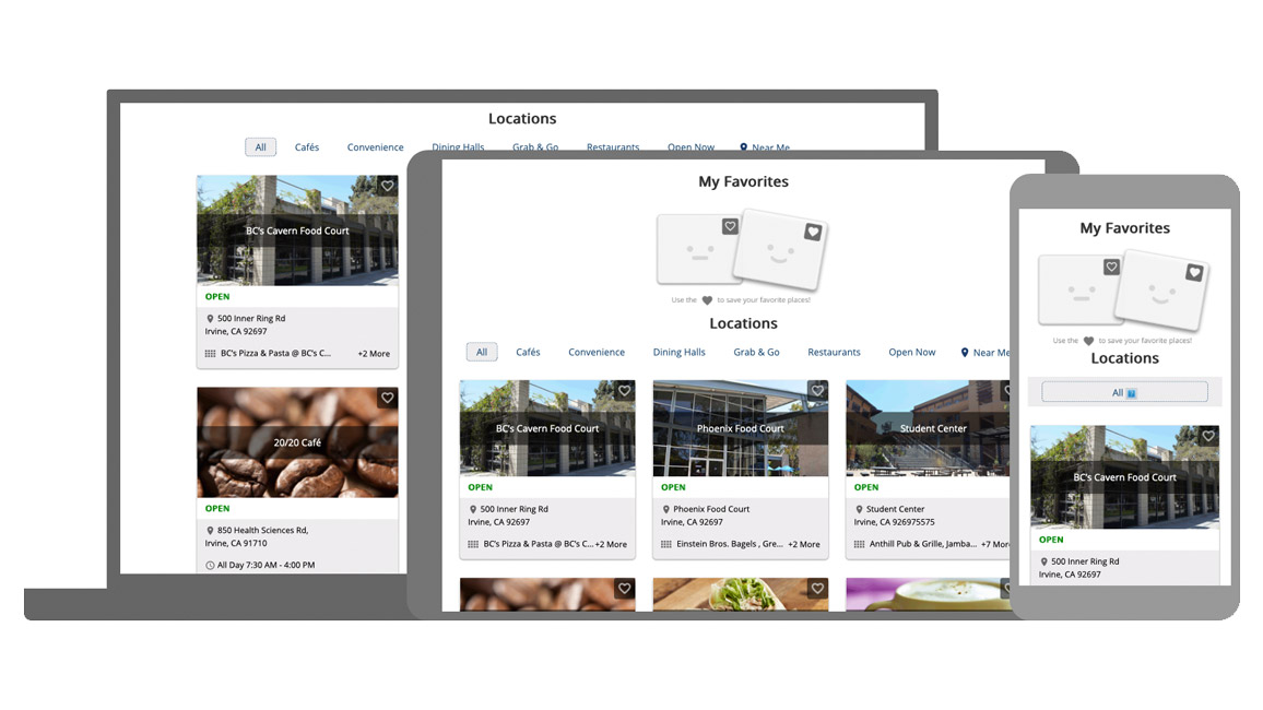
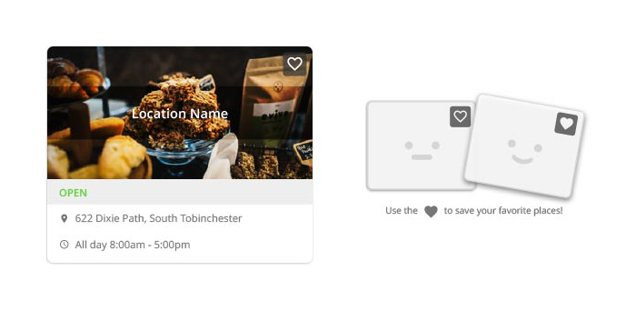
Card designs adapt to all screen sizes
We created templates that each location could customize with images and data. Customers responded positively, noting improvement in finding locations and completing purchases. The client shared this feedback after rollout:
"Hope you are proud of your team’s work as much as I am. We have been getting great reviews from the field." — Follow up from the client