Action Enabled
How do know where to start when there’s too much data?
Challenge
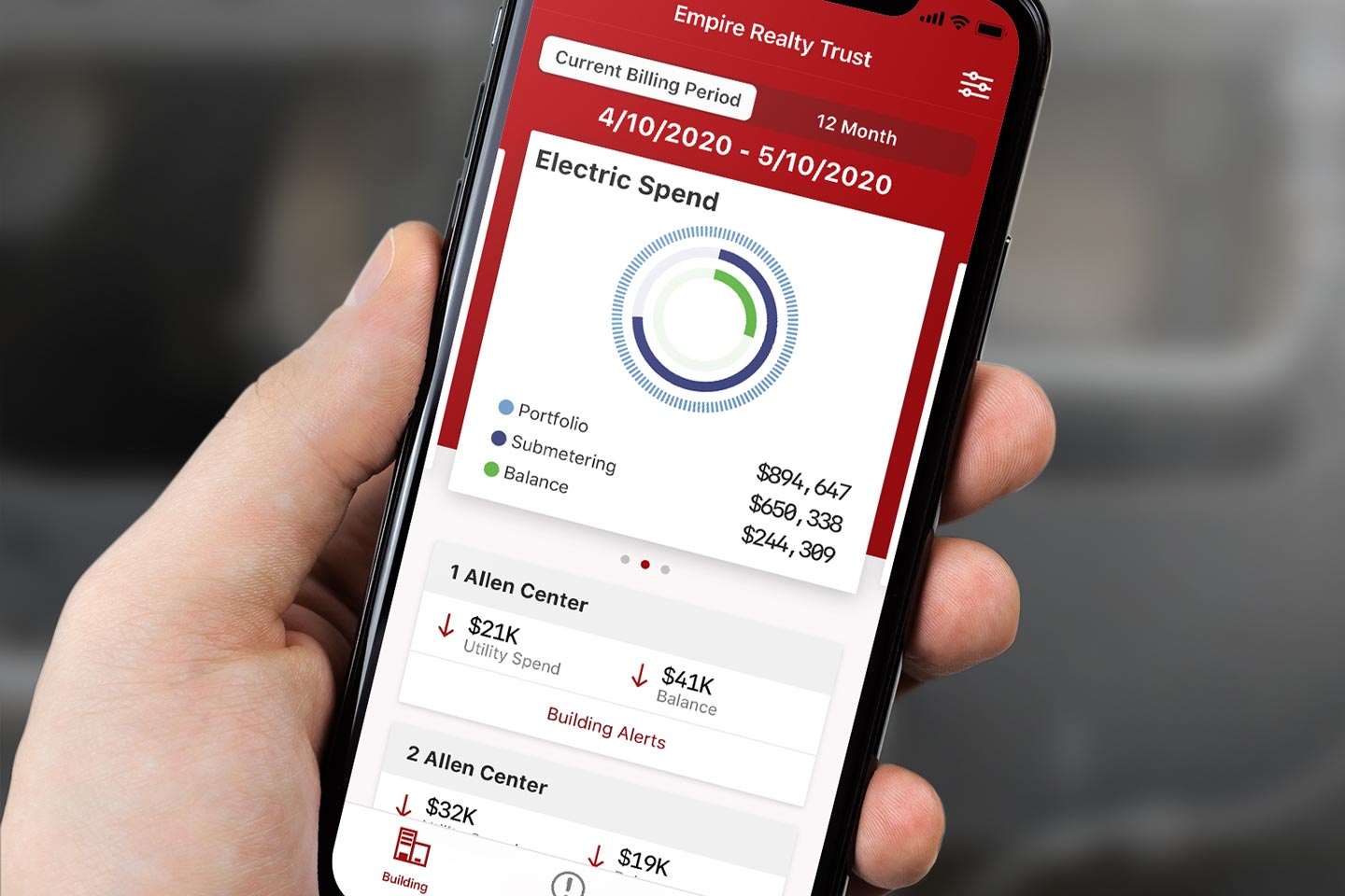
utiliVisor, a leading energy advisory firm, needed a better way to help their customers proactively manage and improve their energy usage. They had massive amounts of data about their customers' energy usage. Hidden in the data were ways to save significant money on energy costs, but customers were having difficulty sifting through it to find what needed their attention. Knowing what to act on could have a huge impact on customers' budgets.
My Role
I led the design strategy and UX direction for this project, working with the business to frame the core problem before moving into solutions. The challenge wasn't just a UI problem — it was a prioritization and communication problem. My role was to help the business understand what information was actually actionable for users, then design a delivery experience around that insight. I owned ideation workshops, user flows, UI and icon design, and quality assurance through the development phase.
Process
Based on interviews with users, I reviewed the reports and worked with UtiliVisor to clarify what the most important and actionable items were. I worked with the business to understand how we could deliver this information in a way that supported their revenue generation and cost structure. I created prototypes to test how to reduce the burden of interpreting the data and deliver concise, actionable tasks to users.
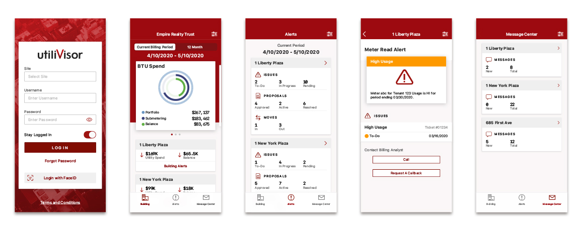
App screens
Results
I created a lightweight delivery interface that alerts users to the most important ways to address their utility consumption. The app surfaces what matters, cuts through the data overload, and gives users a clear path to action. It is available on the App Store for iPhone.